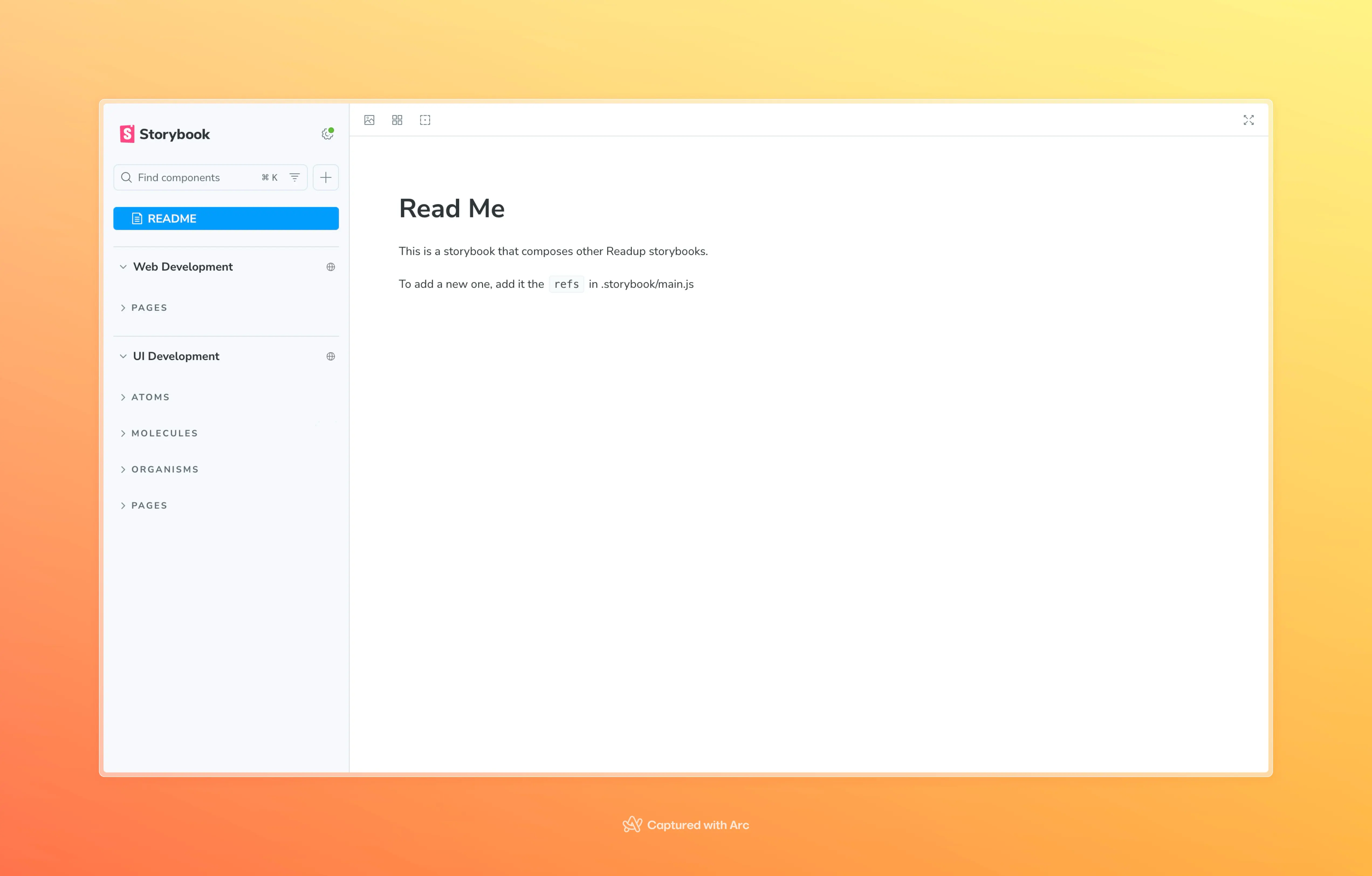
Setting up Storybook Composition for Monorepo-based Next.js and UI packages
... views
Intro
During the course of the project, we organized an independent package called packages/ui to reuse UI components in the Monorepo environment, and introduced Storybook to it first. This package, bundled as tsup, contained design system-centric components such as buttons, inputs, cards, etc. and was organized to be independently verified and developed using Storybook.
👉 The initial Storybook setup was configured by referring to the Turborepo Official Guide.
Initially, we thought this structure was sufficient, but this changed as we wanted to check the UI flow on a per-service page basis. Since apps/web is a Next.js-based app, and the actual pages are created by combining components defined in packages/ui, we needed to visually see "how the components behave on the page".
monorepo/
├── apps/
│ ├── web/ # Next.js app
│ └── storybook/ # Common Storybook apps (covers only ui components)
├── packages/
    └── ui/ # tsup-based UI component packages
To accomplish this, we started with the complacent thought that in addition to fetching components from packages/ui from the existing apps/storybook, why not render pages from apps/web together? We started with a simple idea.
Problem situation
Initially, we were managing all of our stories in a single instance of Storybook called apps/storybook. This structure worked well for most use cases, as we could define each story by importing components from packages/ui. However, when we tried to register pages from apps/web as stories while keeping this structure intact, we encountered a number of issues.
- While
apps/webis powered by Next.js,apps/storybookis a normal React app environment, so we couldn't use some of the unique features of Next.js (likenext/image,next/head, etc.). - The page components in
apps/webdepend on various provider or router contexts, so it wasn't possible to just import them and render them. - we had to set up mock providers, custom decorators, and webpack configurations to mimic the environment we needed, and the structure became increasingly complex, threatening the simplicity, modularity, and maintainability of Storybook, which was the original intent.
In the end, trying to cover everything in a single Storybook instance was compromising the original development goals and principles.
Restructuring
To solve this problem, we decided to redesign the structure itself, with the following key directions
- UI packages and web apps each run as independent Storybooks.
- Turning /apps/storybook into a Storybook Composition hub.
Specifically, we made the following changes:
monorepo/
├── apps/
│ ├── web/ # Next.js 15 application
│ │ │ └── .storybook/ # Project-specific Storybook settings
│ │ └── storybook/ # Integrated Storybook Host
├── packages/
    └── ui/ # Shared UI components
        └── .storybook/ # UI-specific Storybook configuration
- packages/ui
keeps the tsup-based Storybook as before, but runs independently on porthttp://localhost:6007\`. - Configure
apps/webto have a separate Storybook for the Next.js environment, and create stories that reflect the actual page, layout, and context environment (http://localhost:6008) - Refactored
apps/storybookto only act as a hub for Storybook Composition linking these two Storybooks to external Storybooks using therefsoption (http://localhost:6006)
This restructuring separates the development flow of each package, but allows us to manage the entire UI through one unified Storybook view, which makes collaboration, component testing, and documentation easier.
Solution.
In this section, we're going to focus on how we configured Storybook Composition in apps/storybook. We're going to assume that you have Storybook set up correctly in packages/ui and apps/web respectively.
Storybook Composition?
First off, Composition is the ability for one Storybook to pull in other Storybooks that exist externally and present them together in a single UI. Each Storybook must be running independently. Yes, it needs to be running, which means you need to have a server that provides a storybook-static folder that is built in production. In our service, this role is fulfilled by a service called chromatic.
import type { StorybookConfig } from "@storybook/react-vite";

const config: StorybookConfig = {
  stories: ["../src/README.mdx"],
  framework: {
    name: "@storybook/react-vite",
    options: {},
  },
  addons: ["@storybook/addon-essentials"],
  refs: (config, { configType }) => {
    if (configType === "DEVELOPMENT") {
      return {
        web: {
          title: "Web Development",
          url: "http://localhost:6007",
        },
        ui: {
          title: "UI Development",
          url: "http://localhost:6008",
        },
      };
    }
    return {
      web: {
        title: "web",
        url: // web package storybook deployment url
      }
      ui: {
        title: "UI",
        url: // ui package storybook deployment url
      },
    };
  },
};
export default config;
How it works
# Terminal 1: UI Storybook
pnpm --filter packages/ui storybook

# Terminal 2: Web Storybook
pnpm --filter apps/web storybook

# Terminal 3: Composition Storybook
pnpm --filter apps/storybook storybook
By running the three storybooks in parallel, we can see the unified UI at once in apps/storybook. We can maintain the development flow of each package, but have a centralized storybook hub to see the UI flow of the entire project. Of course, you can also use turborepo or any other cli tool to run in parallel.
Storybook Ref?
refs is a feature that integrates and displays externally existing instances of Storybooks into the left Navigation Pane of the current Storybook. In other words, this option _fetches the JSON meta information of a Storybook, whether local or remote, and merges the list of components.
- title`: The name that will be displayed in the Navigation Pane.
- url
: The URL of the external Storybook instance. This is usually thestorybook devaddress (localhost:port`) of that package, or the address of a deployed static Storybook.
In the example above, we're running both the ui and web Storybooks locally at the same time during development and checking Composition.
🧠 Note that internally, we access /index.json after url to parse the meta information.
This means that Composition needs to be reachable as http://localhost:6006/index.json for it to work.
apps/storybook (ref viewer)
├── refs/
    ├── ui (http://localhost:6006)
    └── web (http://localhost:6007)
```text

This structure is characterized by the fact that Storybook is not fetching the actual component code, but rather "proxying" that story in an **iframe**:

| Item | Description |
| --------------- | ---------------------------------------------------- |
| 🔧 Build method separation | Each package's Storybook can be built and deployed independently |
| 📦 Dependency isolation | `apps/storybook` has no actual code or component dependencies |
| 🚀 Easy to scale CI deployments | Each package's Storybook is hosted separately, and Composition is statically referenced.
| 👀 Faster page initial loading | Initial Composition storybook loads quickly

With this basic Storybook Composition setup, we were able to get our Storybook Composition working, but we ran into one unexpected problem.

### CORS error in local environment

When I set up Storybook Composition and ran `apps/storybook`, everything seemed fine at first. However, if any of the external Storybooks (`packages/ui`, `apps/web`) linked by `refs` were not yet running or were still loading, I would get the following **CORS error** and the Storybook would not display properly.

![[image-1.webp]]

This issue has also been discussed in [official GitHub issue #17696](https://github.com/storybookjs/storybook/issues/17696), the gist of which is as follows:

> Storybook Composition accesses the `/index.json` of an external Storybook specified by `refs.url` to parse its meta information, and if that server hasn't **started yet** or the port is empty, the browser will receive an invalid response or an error page that is **not HTML**.
> The browser will consider this a **CORS policy violation** and block it.

### Workaround: Wait for the refs target to be ready with `wait-on`.

To solve this problem, I used a library called [`wait-on`](https://www.npmjs.com/package/wait-on) in `apps/storybook`, which allows you to **wait for a specific port, URL, file, etc. to open normally** and then execute the following command

```json
"scripts": {
  "storybook": "wait-on http://localhost:6006 http://localhost:6007 && start-storybook -p 6008"
}
This is especially useful when running multiple packages in parallel, such as turbo run storybook.
Configure your deployment environment Composition
In my local development environment, I referenced each package's Storybook instance by its localhost-based URL, but this doesn't work in a deployment environment. In particular, if you want your team members to be able to access your Storybook from anywhere, you need to configure Composition based on a statically hosted Storybook. To do this, I utilized [Chromatic] (https://www.chromatic.com/).
Register each package as an individual Storybook project
I registered each package (packages/ui, apps/web, apps/storybook) as an independent Chromatic project.
This gives us the following addresses
packages/ui:https://<project-id>.chromatic.comapps/web:https://<project-id>.chromatic.comapps/storybook:https://<project-id>.chromatic.com
Each project will have its own URL, which will be used to reference other Storybooks in apps/storybook.
Stable refs organization with Permalinks
Chromatic's default deployment URL changes based on the build ID, so it's a pain to have to reflect the new address in refs every time.
To solve this problem, I used [Chromatic's Permalink feature] (https://www.chromatic.com/docs/permalinks).
Permalinks are not URLs that are pinned to a specific build, but rather **fixed addresses that automatically reflect the latest build by branch (e.g.
main).
// apps/storybook/.storybook/main.ts (production)
refs: {
  ui: {
    title: 'UI Components',
    url: 'https://<branch>--<appid>.chromatic.com',
  },
  web: {
    title: 'Web App',
    url: 'https://<branch>--<appid>.chromatic.com',
  },
}
This way, whenever you migrate to the main branch, it will automatically reflect the latest Storybook build, apps/storybook`, and you'll always be able to preview the latest UI without having to make any manual changes.
Outro
At first, I thought it was enough to just apply Storybook to packages/ui, because I didn't need to see the pages used by the actual service. But as the project grew, and I wanted to see where and how a component was used, I realized that opening the code, opening a browser, taking logs, etc. It became a lot more cumbersome than I thought it would be, and I realized that I wasn't the only one who needed to see it, but other team members did as well. I curiously tried to extend Storybook to apps/web, but it wasn't as easy as I thought, and when I tried to do everything in apps/storybook, the structure became more complicated and difficult to maintain. So we decided to have a separate Storybook for each package, and let apps/storybook just assemble them.
As a result, we now have:
- Each package is developed independently
- We can quickly see the entire UI in one Storybook hub, and
- team members can easily check out components by sharing a single link.
It's technically satisfying, but most importantly, we've become much more efficient when collaborating. It was a great reminder that Storybook isn't just a documentation tool, it's a great way to communicate across the team.
Reference